Get to know the artist behind Acqua di Parma’s sunny fragrance.
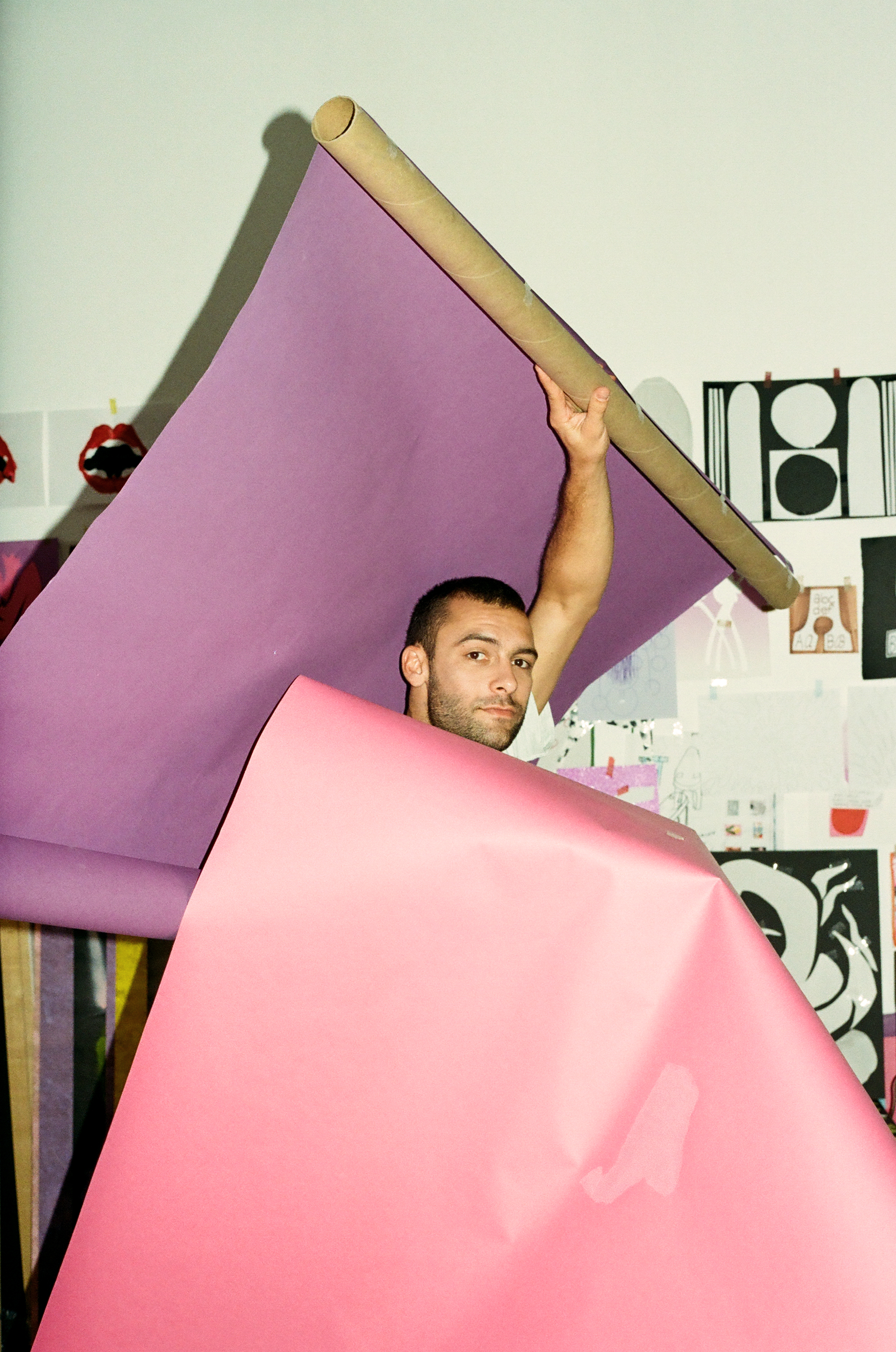
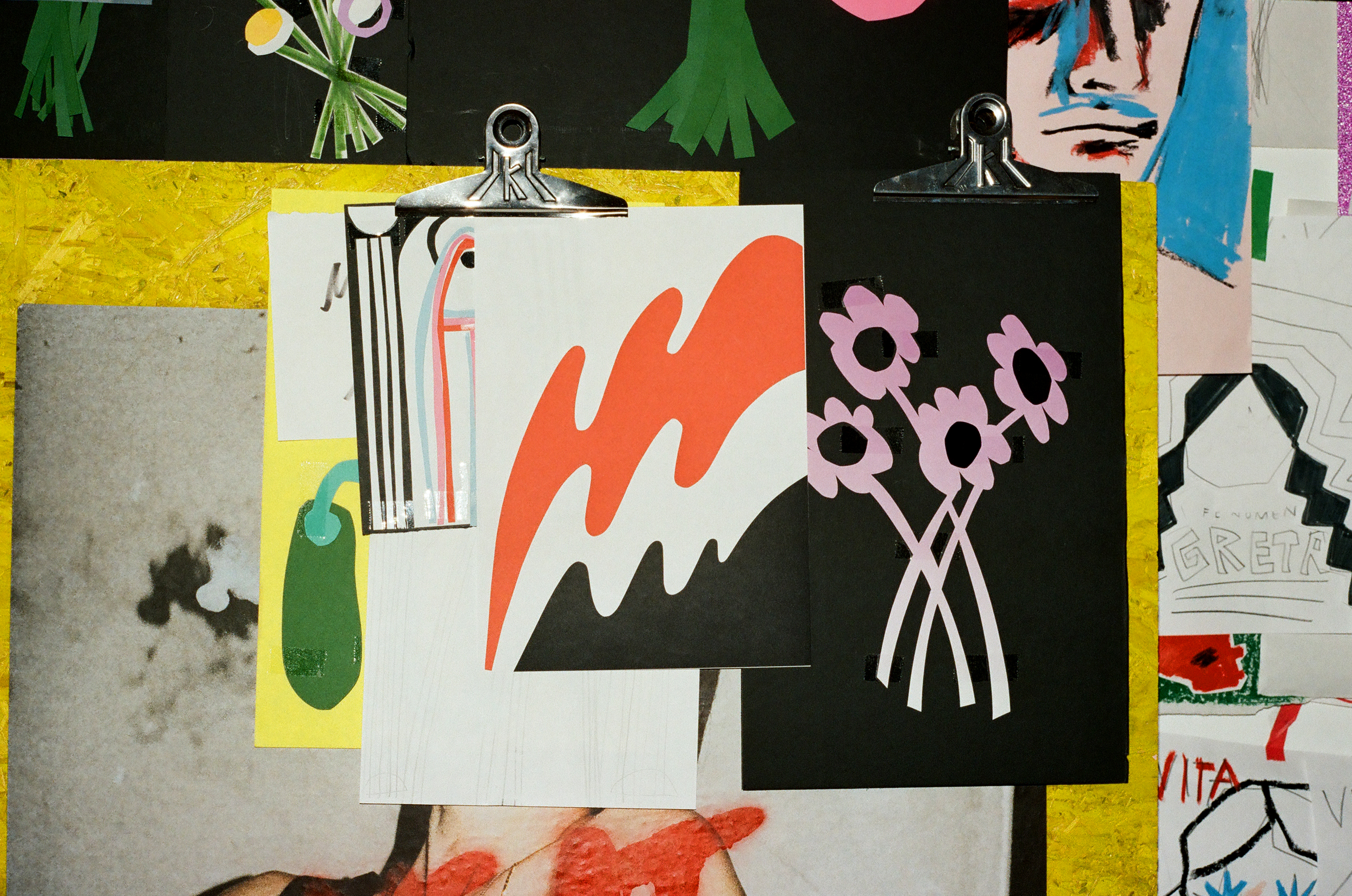
He’s made work for underground icons and big brands alike, and refuses to inhabit any realm except his vivacious own. We’re talking about Gio Pastori, of course, the bubbly Milan-based artist and Forbes 30 Under 30 honouree injecting the world with a generous dose of cut-and-paste colour. Travelling to the Italian fashion capital with Acqua di Parma, the fragrance superpower for which Pastori conjured up his latest creation, Glamcult got you an exclusive peek into the daily rites and rituals of the rising artista di belle arti (who happened to be just as cute as his collages).
Gio, tell us about your day-to-day rhythm. What does an average day in your life look/sound/feel/smell like?
In the last few years I’ve started to surround myself with people and things I feel comfortable with, which was actually an important step for me. I share my house with a painter and a weaver, and I share my studio with craftsmen and tailors. The music flows from the speakers and headphones all day—my brother Elia, a drummer, is my primary source for new tracks. I feel lucky not to have a real routine; I work on my own and organize my time in weeks, using a diary where I write down what to do, the letters bigger or smaller depending on the urgency. I prefer being on my own for the first part of the day because it helps me think clearly. I spend most of my time at the studio, working on personal or commercial projects, watching TV series, eating Korean food or pizza, or just chilling with the friends who come to visit. I like to cook for them, get high with them, party with them and escape from the city for the weekend.
What rituals, normal or paranormal, do you consider fundamental?
I water the flowers at home when I wake up.
I take showers as a therapy, up to three or four a day in extreme situations.
I match my sunglasses with my outfits.
I see what people are doing on Instagram and Twitter.
I walk instead of drive or be driven; it releases my stress.
I stay updated with friends and family through group chats.
I drink a Negroni to transition from my studio mood to social life.
You studied, live and work in Milan. To what extent does this “fashion capital” influence what you do? And how would you describe your relationship to the world of fashion?
Fashion renews every few months, I find it ridiculously fast, and Milan is a constant source of visual fashion input. Not only for the excess of fabulousness you can see all around you, but mostly for its ability to make you more aware of what surrounds you—anything can became inspiration, it’s like eye training. I really appreciate seeing how people decide to get dressed, I think about it a lot on public transportation. Work-wise I appreciate how fashion in Milan embraces and involves diverse people from different creative fields to work on projects with an artistic potential that goes way beyond clothes.
Your work is generally very uplifting and bright, with hints of subtle erotica here and there. Have you ever been attracted to a darker side of yourself or the arts?
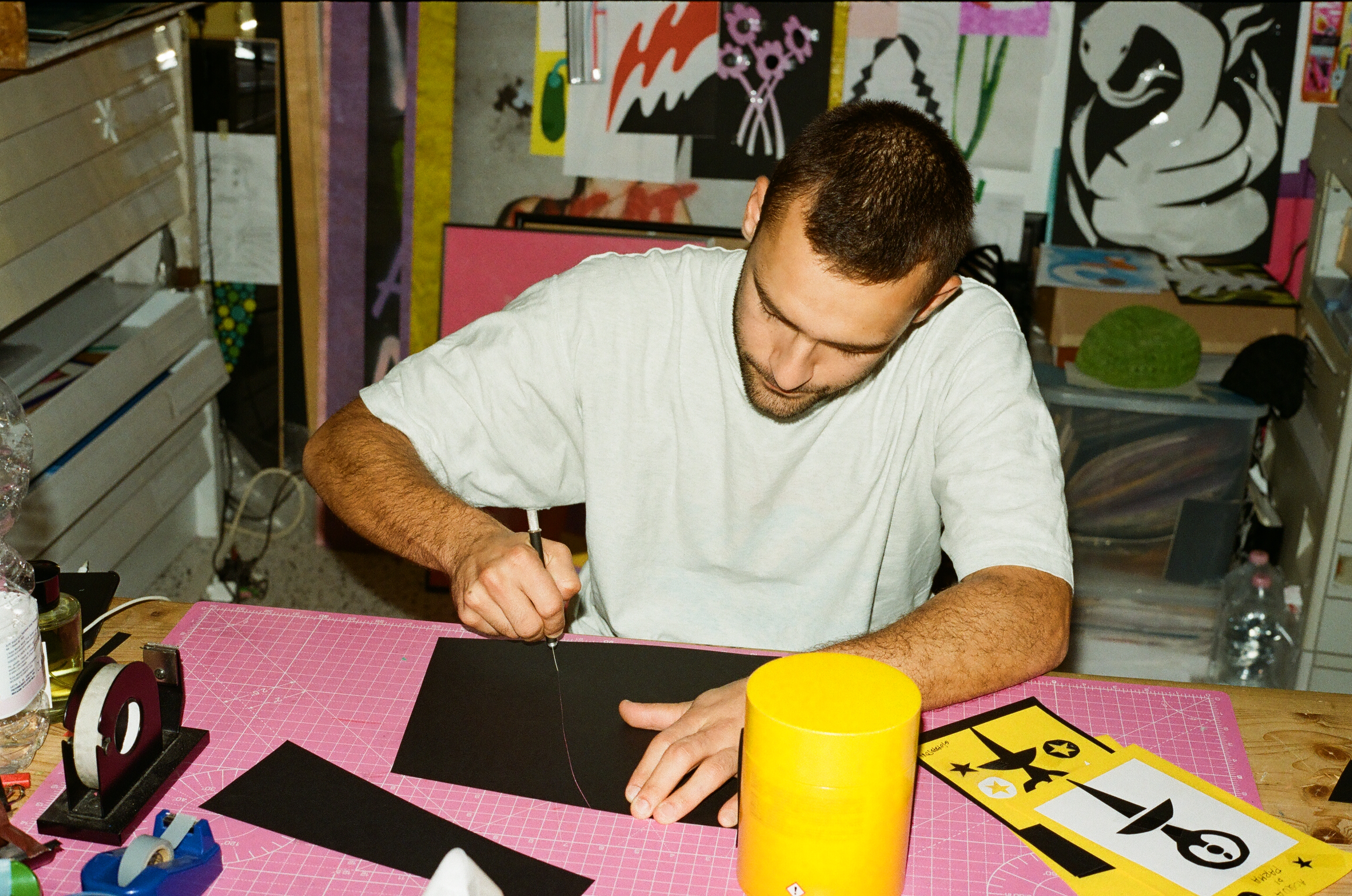
I feel like these last months I’ve been heading into a different phase of my work. I’ve always kept myself busy. mostly with commercial commissions, developing a personal style. In the last five years, that made me more conscious of the link between my brain and my hands. This first maturity leads me to wanting to express my personal world to an audience, to put my soul in this cycle too.
In the world of Gio Pastori, colour is obviously crucial. Do you remember the first time a certain colour truly shook you? And is there a certain colour you’d rather not work with?
A lot of colours and colour combinations of my childhood speak to me. But the blue of Giotto’s starry sky at Scrovegni Chapel in Padova truly shook me when I was a child. I have no problem with any colour in particular, as long as it’s well combined or used.
You’re part of the collective behind M¥SS KETA. Who is she (to you)? What exactly do you do for her? And how important is music to you as a visual artist?
MOTEL FORLANINI is family. We are first of all friends, a group of people sharing real life, in sickness and in health. Musicians, visual artists, producers, video makers and fashion stylists and designers. Everyone sharing skills and collaborating to create great content. The most exciting project for me was probably the design and realization of the set for M¥SS KETA’s music video, MONICA, directed by Simone Rovellini. M¥SS is the main project. Since the golden, underground times, her power has reached and touched a great number of souls. As a living provocation, M¥SS creates chaos and scandal in a society focused on the “normal”, scared of what they might consider “paranormal”, and therefore dangerous. But something is changing and people are getting used to her noisy presence—more and more people are starting to listen.

As a young artist, how do you end up working for big brands such as Acqua di Parma, Apple and Armani? What advice would you give to our readers, especially recently graduated artists, on collaborating while staying true to yourself?
I’m glad my work is appreciated by different kinds of clients. What I try to do when working with big names is be the most direct, simple and understandable. Since the audience is larger, the visual message should be universal. To be able to stay true to yourself, your style and ethic, is never easy with any client, and it’s a skill you learn with time and experience.
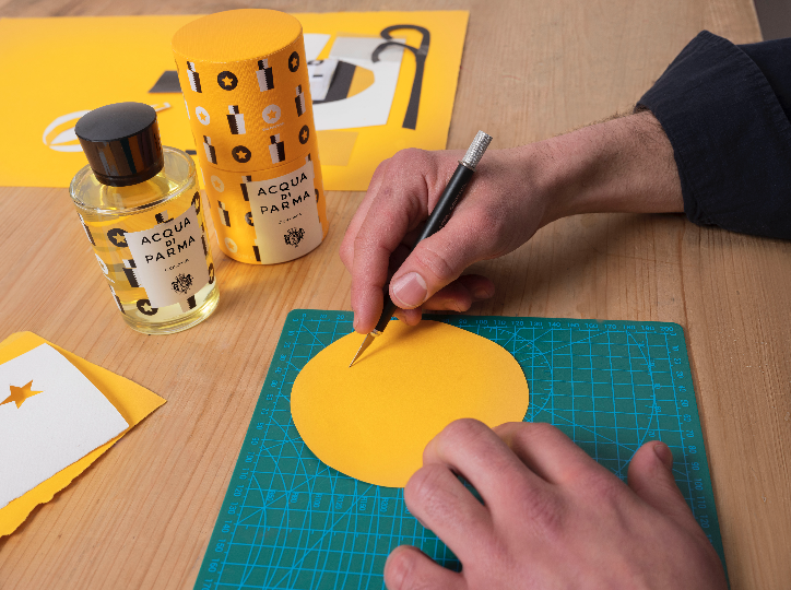
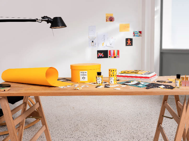
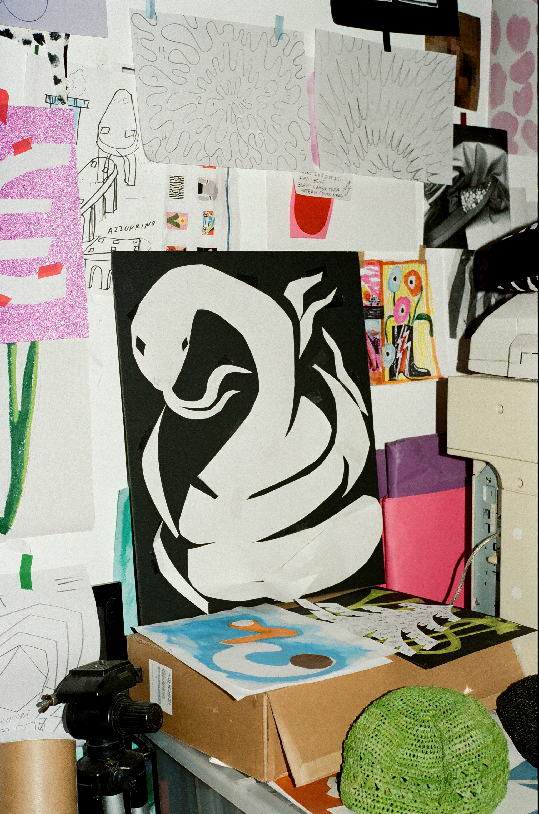
For Acqua di Parma you created the new Colonia Artist Edition artwork. Where do you start when you’re asked to create work around a scent?
From the start I was given total freedom to create a first key visual for the holiday season campaign because they wanted to start from my personal vision. I started collecting ideas, inspired by personal research full of traditional references mixed with psychedelic shapes and colours. These proposals were considered too extreme, too colourful and not Acqua di Parma enough. But what at first could appear as a failure evolved into a process that actually lead to the final output. It was the result of a dialogue between the Acqua team and me, in which I learned a lot about many commercial aspects and needs that my artistic ego couldn’t initially understand. But, I have to stress, I’m happy with the final artwork.
The Acqua collaboration is surprisingly monochrome. Where did that colour scheme come from? And how does it relate to the product?
So the first ideas were extremely colourful. While developing this project, I developed a deeper consciousness of what was the right result. And, as I said before, in the case of a big audience it’s better to be as understandable as possible. I decided to go minimal and celebrate the yellow colour that already represents the brand in all its essence. I simply sprinkled a little bit of magic dust and cut-out boldness on it.
Coming back to our (PARA)NORMAL theme, do you identify more with “normal” or “paranormal”?
If normal means homologation, then I’d say paranormal.